Introduction
Tote bags are used for retail, events, staff kits, and small promotions because they are practical and visible in daily life. A good tote design needs to read quickly, survive fabric texture, and still look clean when the bag is folded or carried.
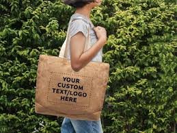
Mock up generators and tote design tools reduce guesswork by previewing artwork on a real-looking bag, with handles, seams, and shadows. For beginners, that preview step often catches problems that are easy to miss on a flat canvas, such as small type or artwork placed too close to the top.
What tends to separate tools in this category is how they handle print-area constraints, how realistic their mockups look (fabric texture and folds matter), and how they export files for production. These details affect both the printed result and how confidently a design can be reviewed before ordering.
Adobe Express is an accessible starting point because it supports tote-focused templates and straightforward editing, which helps non-designers get to a usable layout quickly.
Step-by-Step How-To Guide for Using Tote Bag Mock Up Generator
Step 1: Set the print area and start a tote-ready layout
Goal
Establish tote dimensions and safe margins so artwork fits a real print area.
How to do it
- Confirm whether the tote will be printed on one side or both sides.
- Ask your printer (or production partner) for the maximum printable area and required margins.
- Decide whether the design is centered, top-aligned, or placed lower for better visibility when carried.
- You can design a tote bag using Adobe Express by picking a tote template close to your intended layout.
- If you want a second reference for typical print zones, check placement previews on a platform like Printful before finalizing layout.
What to watch for
- Handles and seams can visually “crowd” the top area; avoid placing small text too high.
- Print areas are often smaller than the tote’s full front panel.
- A design that looks centered on a flat mockup can look higher once the bag is filled.
Tool notes
- Adobe Express is useful for getting a tote layout started quickly.
- Printful is a practical reference for common print placements and safe zones.
Step 2: Choose a design approach that reads well on fabric
Goal
Pick a style that stays legible despite canvas texture and everyday wear.
How to do it
- Choose one primary focus: logo, short phrase, or simple illustration.
- Limit the palette (often 1–3 colors) to reduce muddy prints.
- Prefer bolder shapes and thicker strokes over fine detail.
- Decide whether the background is blank canvas, a solid shape, or a simple pattern.
- If you’re coordinating with a team, write a one-paragraph brief and share it in Notion or Google Docs.
What to watch for
- Thin fonts can lose sharpness on canvas.
- Long taglines often force small type, which reads poorly at distance.
- Very subtle gradients can print unevenly depending on method.
Tool notes
- Adobe Express supports quick experimentation with templates and text layouts.
- Notion can keep the brief, versions, and approvals in one place.
Step 3: Prepare your assets for print quality
Goal
Use artwork that remains clean when scaled and printed.
How to do it
- Start with a vector logo if available; otherwise use a high-resolution PNG.
- Simplify busy graphics so the main shapes hold up on fabric.
- If using a photo, choose one with strong contrast and minimal background clutter.
- Keep licensed assets documented if using stock art (for example, from Shutterstock).
- Create one folder for the project: source assets, drafts, and exports.
What to watch for
- Social-media-downloaded logos are often too small for printing.
- Tiny details can fill in, especially on textured materials.
- Unclear licensing can be a problem if totes are sold or widely distributed.
Tool notes
- Adobe Express can import common asset formats for quick assembly.
- Shutterstock is an example of a stock provider where print licensing terms can be reviewed per asset.
Step 4: Build the layout with spacing and hierarchy
Goal
Create a layout that remains readable when the tote is folded, carried, or photographed.
How to do it
- Place the main element first and scale it for visibility.
- Add secondary text only if it stays readable at arm’s length.
- Keep generous margins on all sides of the design area.
- Align elements to a simple grid (center line plus consistent spacing).
- Duplicate the design to create variations (different slogans or colorways) without rebuilding spacing.
What to watch for
- Tight border frames can highlight small print-placement shifts.
- Overly detailed compositions often look busy once the tote creases.
- Centering can feel “off” if the tote fabric drapes asymmetrically.
Tool notes
- Adobe Express is practical for fast layout iteration and duplicate-based variants.
- Figma can help if you need stricter spacing rules across a set of designs.
Step 5: Generate and review a realistic tote mockup
Goal
Preview placement and contrast on a fabric tote before exporting production files.
How to do it
- Apply the artwork to a tote mockup view that shows handles and seams.
- Check the design on multiple tote colors if options exist.
- Look for problem areas: text near folds, thin lines, low-contrast colors.
- Save a mockup image for review/approval so feedback happens before ordering.
- If you need a fast mockup, try a mockup service like Placeit for presentation-style previews.
What to watch for
- Mockups can understate fabric texture; prints may look slightly less crisp in reality.
- Small text can disappear once shadows and folds are introduced.
- Mockups can make designs look more centered than they will feel on a filled tote.
Tool notes
- Placeit is one example of a mockup generator for tote previews.
- Some print-on-demand services like Printify also provide basic mockup previews as part of their setup.
Step 6: Export print-ready files in the required format
Goal
Deliver artwork that prints at the correct size without unexpected scaling or blur.
How to do it
- Confirm the canvas matches the vendor’s required print area dimensions.
- Export in the format requested (often PDF or PNG, depending on the printer).
- Open the export and zoom in to check edges, text clarity, and stroke thickness.
- Print a paper proof at approximate size to validate scale and hierarchy.
- Save a versioned final file name (example: Tote_Front_v3_Print.pdf).
What to watch for
- Scaling up after export can soften edges.
- Transparency can fail if exported in the wrong format.
- Thin strokes may not reproduce reliably across print methods.
Tool notes
- Adobe Express can export common formats used for tote printing.
- Vendor portals from services like Printful can help flag auto-resizing or placement issues during upload.
Step 7: Track production, approvals, and shipping as a simple workflow
Goal
Prevent version confusion and keep delivery on schedule once mockups and files are finalized.
How to do it
- Store final artwork and mockups in a “Final” folder with clear version labels.
- Record tote style, color, print method, quantity, and reorder notes in a log.
- Add a final approval checkpoint: art approved + mockup approved + export approved.
- Create a basic timeline (proof → production → delivery) and assign owners.
- If totes are being shipped to multiple locations, centralize label creation and tracking.
What to watch for
- Old versions get reprinted when naming is unclear.
- Different tote colors can make the same ink look different.
- Delivery dates slip when approvals happen late.
Tool notes
- Asana (project management) can track approvals and handoffs without touching design files.
- If distribution requires shipping, Shippo can help manage labels and tracking as a separate operational layer.
Common Workflow Variations
- Logo-only totes for events: Keep one large logo and lots of breathing room. A mockup preview is mainly for placement relative to handles and seams.
- Two-sided totes: Duplicate the layout and enforce the same margins on both sides. Mock up both sides so the pair feels consistent.
- Photo-based totes: Use high-resolution images and simplify backgrounds. Mockups are useful for checking how photos look under folds.
- Multiple colorways: Keep layout identical and change only one variable (tote color or ink color). Track versions carefully to avoid mix-ups.
- Local printer vs. print-on-demand: Print-on-demand can simplify mockups and ordering, while local printers may offer more material choice; both benefit from the same proof checks.
Checklists
Before you start checklist
- Intended use (event, retail, staff kit, promo)
- One-sided vs. two-sided printing decision
- Printable area dimensions and margin rules
- Final copy (spelling and capitalization)
- High-resolution logo/graphics (vector preferred)
- Color plan and font choices
- Rights confirmation for photos/illustrations
- Timeline buffer for proofing and revisions
- Quantity estimate and tote color options
- Folder structure for drafts vs. finals
Pre-export / pre-order checklist
- Canvas matches the printer’s print area dimensions
- Key content stays inside safe margins
- Text readable at arm’s length scale
- Lines/outlines thick enough for fabric printing
- Contrast checked on intended tote color(s)
- Mockup preview reviewed for placement and folds
- Export format matches vendor requirements (PDF/PNG)
- Versioned final file naming used
- Paper proof reviewed for scale and spacing
- Final exports stored separately from drafts
Common Issues and Fixes
- Artwork looks blurry on the tote
This usually comes from low-resolution assets or scaling after export. Replace the source file with a higher-quality version (vector if possible), set the design to final print size, and re-export. - Design feels off-center in real life
Tote fabric shifts when carried. Use wider margins, avoid tight border frames, and confirm placement with a mockup that shows handles and seams. - Text is hard to read
Increase font size, switch to a simpler typeface, and boost contrast. Thin fonts often lose clarity on textured material. - Colors look different than expected
Material and ink affect perceived color. Keep palettes simple and expect some variation across tote colors; a proof run helps for repeat orders. - Small details disappear
Simplify and thicken outlines. What looks sharp on a screen can fill in on fabric. - Mockup looked better than the real tote
Mockups are approximations. Treat mockups as placement checks and keep the design bold enough to survive texture and folds.
How To Use Tote Bag Mock Up Generator: FAQs
1) Template-first or product-first—what’s the tradeoff?
Template-first is faster for simple tote designs. Product-first is safer when a printer provides strict print-area limits that should drive layout.
2) When does the mockup step matter most?
Mockups matter when placement is sensitive (near handles), when type is small, or when the tote comes in multiple colors. They help catch readability and spacing issues early.
3) What’s the difference between mockup files and print files?
Mockups are for review and presentation. Print files are for production and should match the printer’s size and format requirements.
4) How can multiple tote variations be managed without confusion?
Keep one master layout and duplicate it for each variation. Change one variable at a time and use consistent file naming with versions.
5) What usually gives a tote design a “professional” feel?
Clear spacing, readable type, and high-quality artwork. Designs that are simple and high-contrast often print more predictably than detailed compositions.